Add a chart to a data set
DataMiner has a variety of tools to help you transform your data sets into full-featured charts and graphs for in-depth data analysis by factory personnel. After you retrieve, group, and summarize data in a DataMiner workbook, you can create dynamic charts quickly and easily. This topic takes you through the high-level steps to create a chart from a DataMiner data set using the Chart wizard.
Tip
For more information about the Chart wizard data selection and formatting options, see Use the Chart Wizard.
Log into the FactoryLogix Analytics client application.
Select the Data Miner/Data Analysis button.
In the DataMiner window, open a workbook and create a new data set or run a template to create a data set.
Sort, filter, and group the data as desired.
Select Execute All.
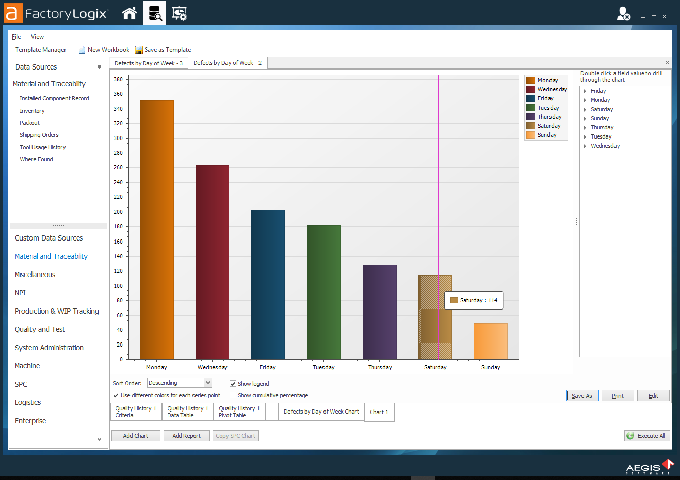
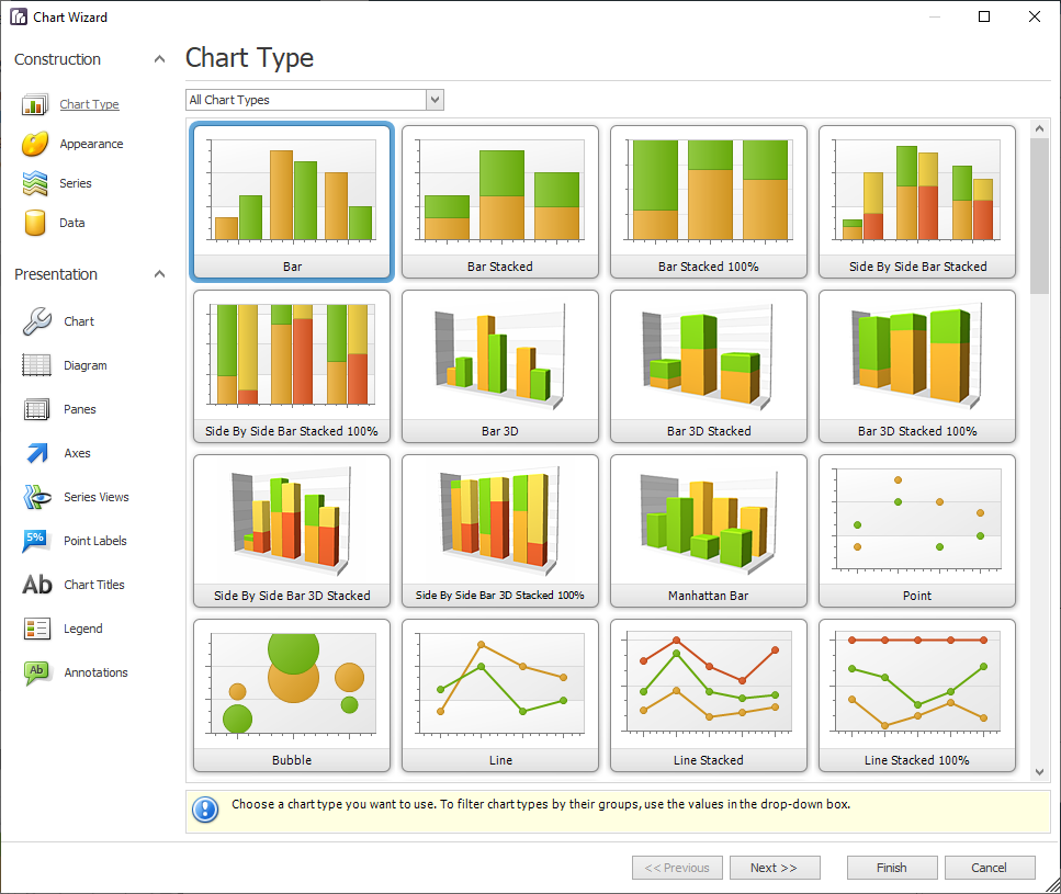
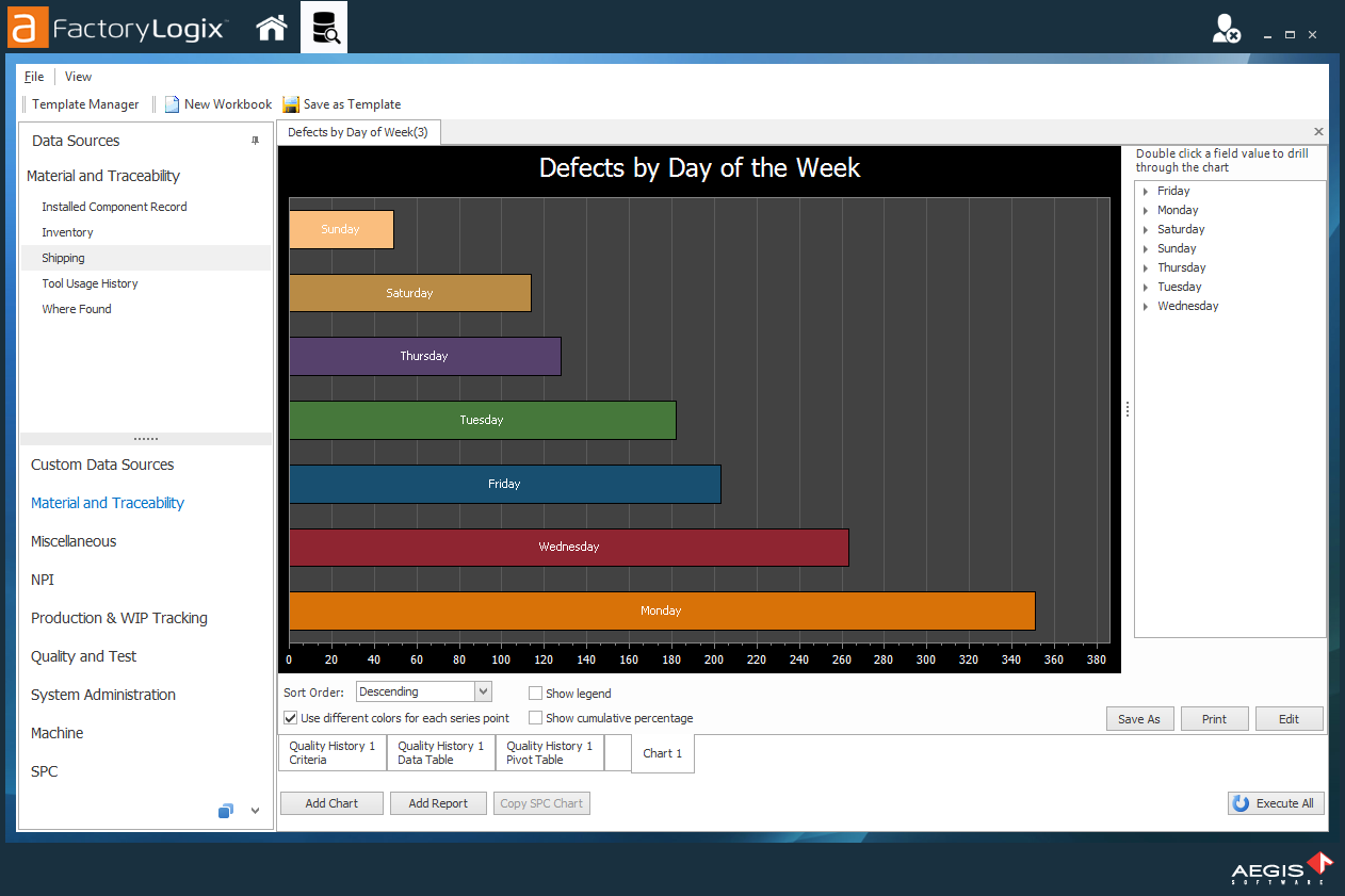
Select Add Chart in the lower left corner of the DataMiner window. (The Bar chart is highlighted by default.)
Important
Flat 1D and 2D bar charts allow you to drill down in the chart based on the column grouping—as long as the chart is run and viewed in DataMiner. 3D charts only accommodate the drill-down functionality by selecting the text fields from the drill down window. In either case, when the chart is published to Production, neither will have drill down capability because the Production client application can only accommodate a single chart for viewing under Reference.
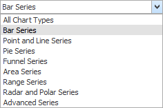
Select a chart type or select a chart series type from the Chart Series drop-down to limit chart selections to a single series type (Bar Series, for example), then select Next.
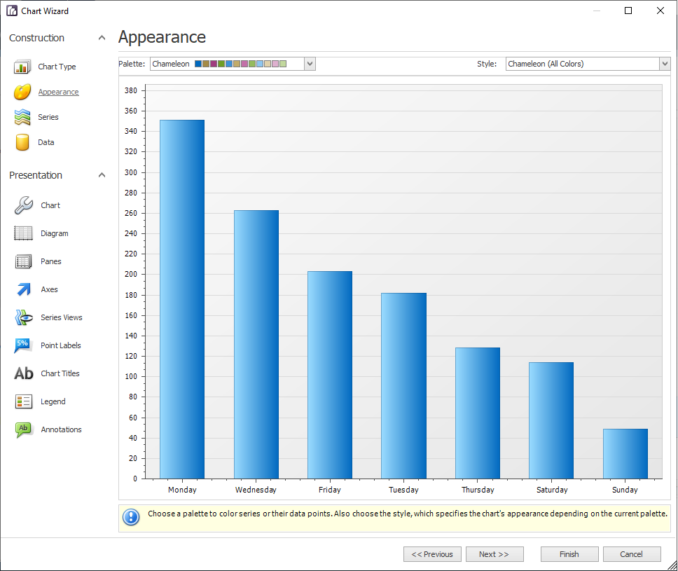
On the Appearance page page, use the Palette and Style drop-downs to change the chart's appearance, then select Next.
On the Series pagepage, create or remove a series of data points. You can also use options to further customize the series data:
Define the series name, visibility, and view type
Enable and customize the Top N Values feature.
Customize additional series and legend point options.
Select Next.
On the Data page page, provide data for the chart and (optionally) customize the data. For example, you can:
Bind a chart or individual series to a data source.
Customize an argument and a value scale type.
Customize the view type of auto-generated series.
Apply data filtering and sorting.
Adjust the pivot chart settings.
Select Next.
On the Chart page page, define the chart background color and background image, then select Next.
On the Diagram page page, you can specify these custom settings:
Rotate the diagram.
Define the diagram's padding.
Add or remove secondary axes.
Add or remove panes.
Define the layout direction of the panes.
Enable or disable scrolling and zooming for the diagram.
Note
The most commonly-used property for a diagram is the Rotated option. It is useful when you have data point with long names that overlap each other in the non-rotated position.
Select Next.
On the Panes page page, customize the properties of the panes you set up in the previous step, then select Next.
On the Axes page page, modify the axes properties. For example, you can:
Customize axes properties and labels.
Add a constant line and a strip to an axis.
Enable automatic and manual scale breaks.
Use the Position options on the Labels tab to prevent data points with long names from overlapping each other by staggering the axes names at an angle.
Select Next.
On the Series Views page, select options to customize the view-type-specific properties of a series. You can also do the following:
Customize the appearance and border settings of a series.
Add or remove financial indicators (Fibonacci indicators, trend lines, and regression lines).
Select Next.
On the Point Labels page page, use the options to resolve overlapping point labels and to customize the appearance of point labels, then select Next.
On the Chart Titles page page, specify a chart title by selecting Add, then enter a name for the chart under Text to replace the default name Chart Title.
Use the options on the Text and General tabs to modify the chart title properties such as font, size, color, and position, then select Next.
On the Legend page page, select Visible, select viewing and other legend properties using the tabs, then select Next.
On the Annotations page page, add an annotation, then enter a name for the annotation, adjust its visibility, z-order, and layout.
Select Finish to add the chart to the DataMiner workbook.
A new tab displays at the bottom of the workbook for the chart labeled Chart 1.Right-click the Chart tab to delete or rename the chart.
To edit the chart's properties at any time, select the Edit button in the lower-right corner of the DataMiner window.
The following table describes additional options for the chart under the chart area of the DataMiner window.
Item | Description |
|---|---|
Sort Order | Allows you to sort the names of the data points in ascending or descending order. |
Use Different Colors for each Series Point | Colors each series point or bar a different color to help differentiate each bar within the chart. |
Show Legend | Shows/hides the legend. |
Save As | Saves a chart or graph as a PDF, HTM, BMP, JPG, GIF or PNG file. |
Prints the chart. | |
Edit | Allows you to modify the properties of the chart. |
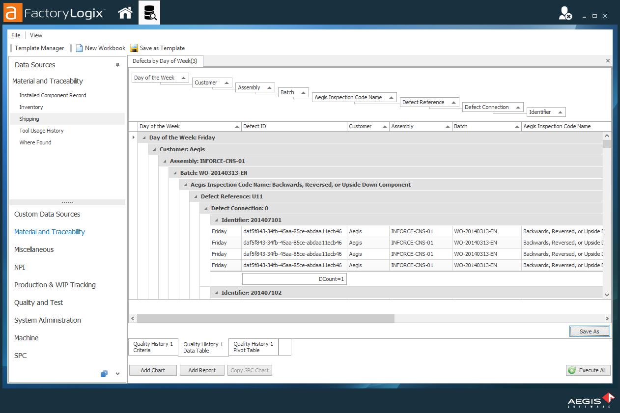
2D Bar charts have drill down capabilities; 3D charts do not. If there are multiple columns in the group, you can drill down through the grouping from highest to lowest.
In the DataMiner window, double-click a bar on the chart to drill down to the data set for the series or double-click a field value on the right side of the window.
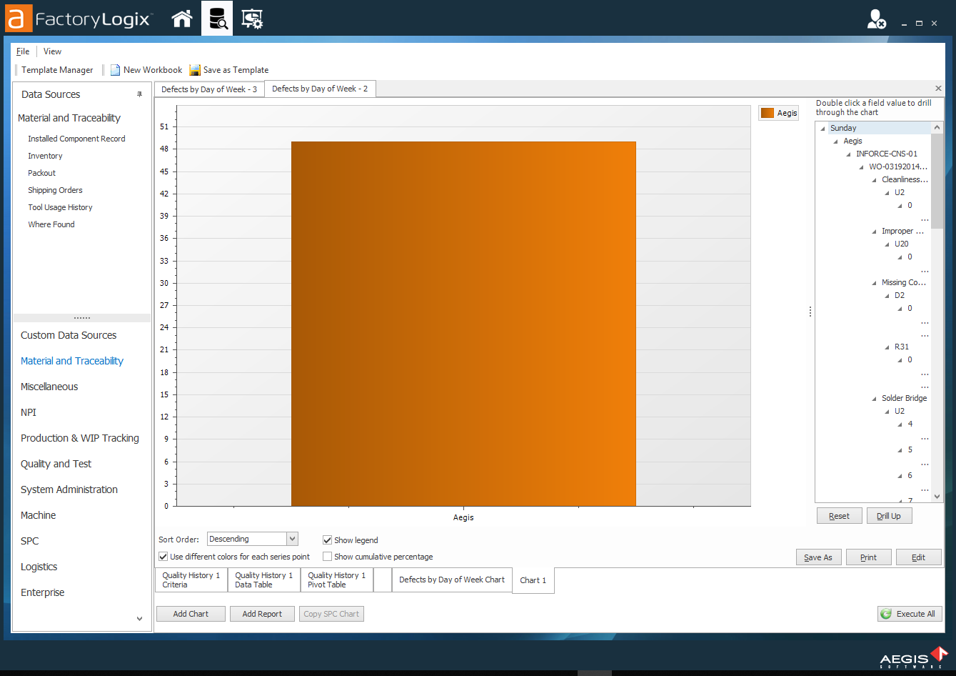
Once you start to drill down, two additional buttons display on the right side of the window under the field values: Reset and Drill Up:Reset returns you to the first set of data points in the chart.
Drill Up drills back up one set of data points each time you select it.
You will also see the data points expand and collapse on the right side of the chart as you select the Reset and Drill Up buttons.
Select the Save As button to save your chart as an image.
In the dialog, enter a Name for the chart, select a format to save it in using the drop-down, then select Save.